Home Logo Concepts
Design direction

The Nexys logo concept

The mark developed for Nexys during this build - the wordmark, its monochrome and reversed variants, a stacked lockup, and an app icon.

In short: A logo is a system, not one file. The wordmark below is the core; the monochrome, stacked and icon variants exist so the mark survives a fax, a favicon, a trade-show banner and a dark video cover without being redrawn each time. Every file is exported at 3× on transparency.

The mark

Wordmark

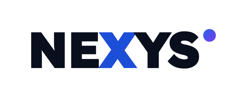
Lexend Deca at its heaviest weight, tightened, with the X picked out in brand blue - the letter that makes the name distinctive - and a gradient dot standing in for the platform.
Wordmark - light backgrounds
Wordmark - light backgroundsThe core mark: Lexend Deca 900, the X carried in brand blue, and a gradient dot marking the platform.Download PNG
Wordmark - dark backgrounds
Wordmark - dark backgroundsReversed out, with the X lifted to Blue 400 so it holds against navy.Download PNG
One colour

Monochrome

The version that still works when colour is not available - the test most logos quietly fail.
Monochrome - ink
Monochrome - inkOne colour, for print, faxed documents, and anywhere the gradient can't reproduce.Download PNG
Monochrome - white
Monochrome - whiteFor photography, dark video covers, and single-colour merchandise.Download PNG
Lockup

Stacked with a descriptor

For audiences meeting the name for the first time, where the mark alone does not say what Nexys does.
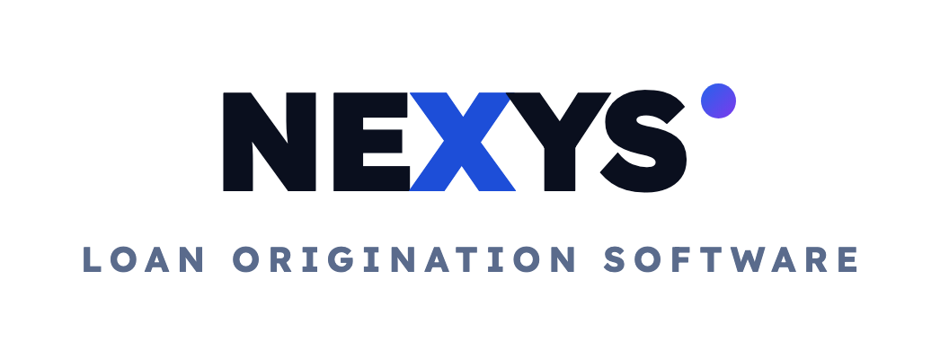
Stacked lockup
Stacked lockupThe mark over a descriptor, for first-touch contexts where Nexys may be unfamiliar - decks, trade booths, PDF covers.Download PNG
Small sizes

App icon

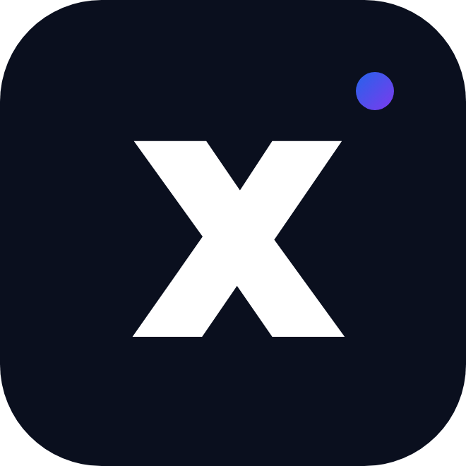
At 32px the full wordmark is unreadable, so the X carries the brand alone - the same letter the wordmark already emphasises.
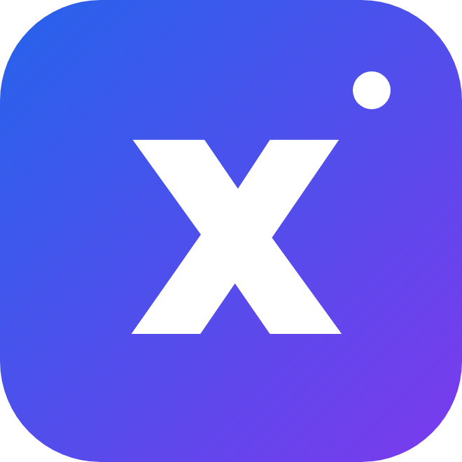
App icon - gradient
App icon - gradientThe X carried alone in the CTA gradient, with the dot as a corner accent. For favicons, app tiles, and avatars.Download PNG
App icon - navy
App icon - navyThe restrained version, for dark UI chrome and places the gradient would shout.Download PNG
Exploration

Five other directions

The wordmark above sets the name in type. These are marks - ideas about what the logo should SAY, each argued from what Nexys does rather than from what looks current. Shown large, in a lockup, and at favicon size, because a mark that only works big is not finished.

NEXYSNEXYS
NexusA hub with three parties joined to it.The literal meaning of the name, and the thing the platform actually claims: broker, lender and vendor working one file instead of emailing three copies of it.
NEXYSNEXYS
FlowThree rising bars - a loan advancing through its stages.Reads as momentum and as a pipeline view at the same time. Closest to the product's day-to-day: a file that keeps moving instead of stalling between hand-offs.
NEXYSNEXYS
CrossingTwo strokes meeting - the X, drawn rather than typed.Keeps the letter the current wordmark already leans on, but makes it a mark in its own right that survives at favicon size.
NEXYSNEXYS
Monoline NA single drawn line folding into an N.The quietest, most institutional option. Lenders are a conservative audience, and this reads closer to a bank than to a startup.
NEXYSNEXYS
DrawsThree stacked bars of increasing length.Draw schedules and construction budgets are what Nexys does that generic LOS vendors do not. The most specific of the five - and the least flexible if the product broadens.

All five are drawn as vector, so any of them can be taken further - different weight, different proportion, paired with a different typeface - once one feels right. Tell us which two you want to see developed.

Usage

How to use it

Do
  • Leave clear space around the mark equal to the height of the N.
  • Use the reversed variant on anything darker than Navy 800.
  • Drop to monochrome rather than recolouring the gradient.
  • Use the app icon below roughly 120px wide.
Don’t
  • Re-set the name in another typeface.
  • Recolour the X outside blue, ink, or white.
  • Stretch, rotate, outline, or add a shadow.
  • Place it on a busy photo without a solid or scrimmed backing.
Colour

Palette

The values the mark and the site are built from.

Nexys Blue#2563EBThe X, primary buttons, links
Blue 600#1D4ED8Gradient start, hover states
Blue 400#3B82F6The X on dark backgrounds
Purple 600#7C3AEDGradient end - the dot and CTAs
Navy 900#0A1735Dark surfaces the mark reverses on
Ink#0A0F1EThe wordmark on light, and body text
Slate#5A6B8CThe lockup descriptor, secondary copy
Mist#F4F7FDAlternating section background
Typography

Type system

Display - Lexend Deca, 700–900

Elevate loan origination

The wordmark is drawn from this face, which is why headlines and the logo feel related rather than merely adjacent.
Body - Inter, 400–600

End-to-end software for loan origination, mortgage CRM, loan servicing, and loan pricing - streamlining every step to boost efficiency.

Body copy, navigation, form labels, captions.
Get started

Want it in another format?

Tell us where the mark has to go - vector, embroidery, signage - and we'll cut the file.

Website by WorkspaceCMS.ai